 620, W-Block, Saket Nagar, Kanpur – 208014
 directorjida@jef.org.in
Opening Hours : Monday to Saturay - 10 Am to 5 Pm
Opening Hours : Monday to Saturay - 10 Am to 5 Pm
It is said that, according to the scripted character behaviours, the body shape, features, and colours are meticulously crafted by designers to create a perfect character. Step into my case study where I explore the intriguing realm of shapes and colours with their influence on character portrayal. As creators, we frequently employ shapes to visually convey character traits, enriching the overall personality of our creations. The most basic shape used in a protagonist's character is a circle or oval. Circles and ovals are commonly employed to depict amicable and sociable facial expressions. you can experiment with putting circular shapes in different parts of a character's body to show the same warm feeling. Shapes resembling squares convey a sense of solidity, as they are associated with straight vertical and horizontal lines, symbolizing strength, stability, and confidence. Squares can both be large and daunting or comforting and clumsy. And finally! the evil shape. Triangles are the most dynamic of the three shapes we mentioned so far. Bad guys and villains are often based upon dominant triangular concepts as they appear malicious and sinister and communicate with the most aggression.it is the circle’s most opposing shape and is often used for antagonist. Colour theory posits three primary colours that can be combined to create all possible colours. They're often recognized as red, yellow and blue(RYB) or red green and blue(RGB). However, the interpretation of colours is subjective and varies across cultures. As a result, creators decide on colour palettes based on the intended cultural context. Many designers opt for diverse colour schemes incorporating subtle nuances or employing unconventional choices For instance in animated movies, designers utilize playful and vibrant colours to captivate children, while horror movies often employ subdued and dark hues to evoke a sense of fear and suspense. Now let us see how these theories were used to make the movie HOTEL TRANSYLVANIA 3 so interesting to watch.
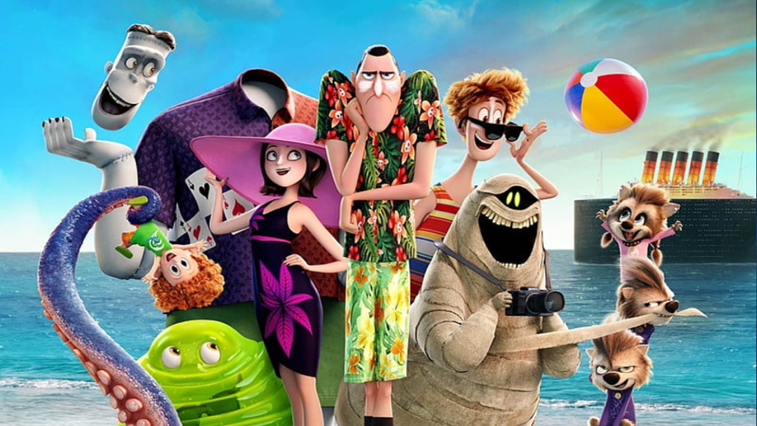
In a world where monsters are unfairly branded as villains, Drac, deeply attached to his family and hotel, reluctantly agrees to a much-needed vacation. Unbeknownst to him, his human zing has a hidden agenda to eliminate all monsters. Drac, oblivious to the danger, opens his heart to love. As the vacation unfolds, it hangs in suspense — will it transform into a delightful love cruise or become a perilous threat to the entire monster generation? This concise narrative explores themes of prejudice, unexpected love, and the struggle for survival, weaving a captivating tale of uncertainty and emotion in the face of misguided human superstitions.
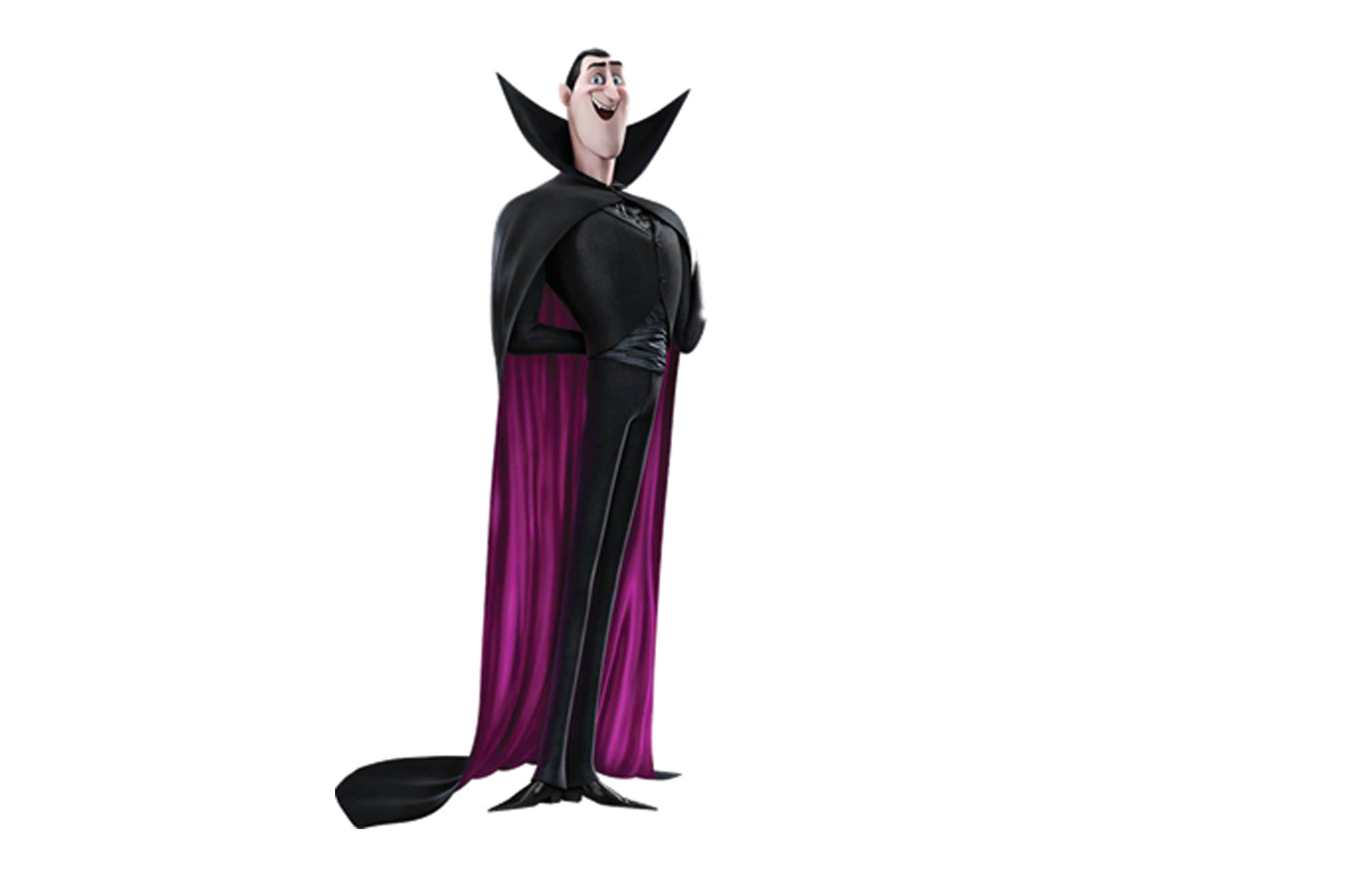
Drac- Protagonist, monster and the Prince of Darkness owns the hotel. His appearance, with a triangular body and edgy clothes, portrays speed and mystery. The rectangular lower part and cloak indicate strength and reliability. Wearing black signifies the human perception of monsters as evil, but a superhero cloak and round eyes reveal his caring nature. His bat-shaped face suggests a hybrid identity, adding complexity to the character in the Hotel Transylvania series.
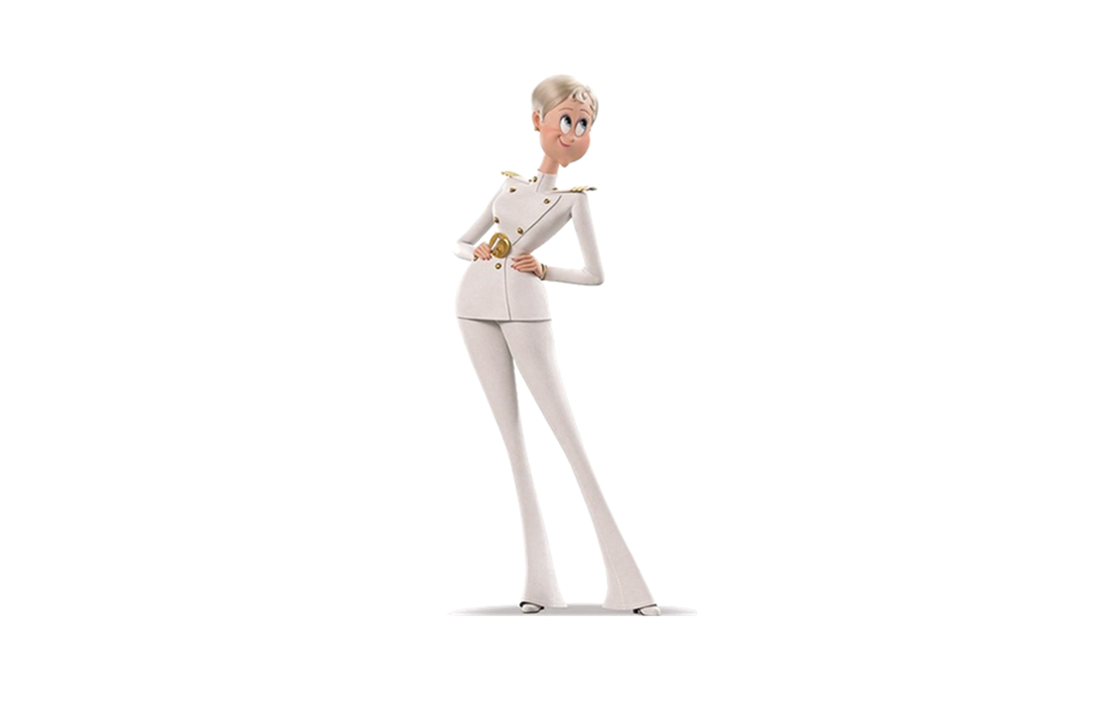
Erica- Erica Vanhelsing, the human ship captain and Drac's love interest, undergoes a transformation from an initially evil demeanour to a commendable leader by the end. Her triangular body shape initially suggests a sharp and evil nature. However, her round face and eyes portray friendliness and approachability, though she can be easily influenced. Her white dress and hair symbolize her positive human nature and kindness.
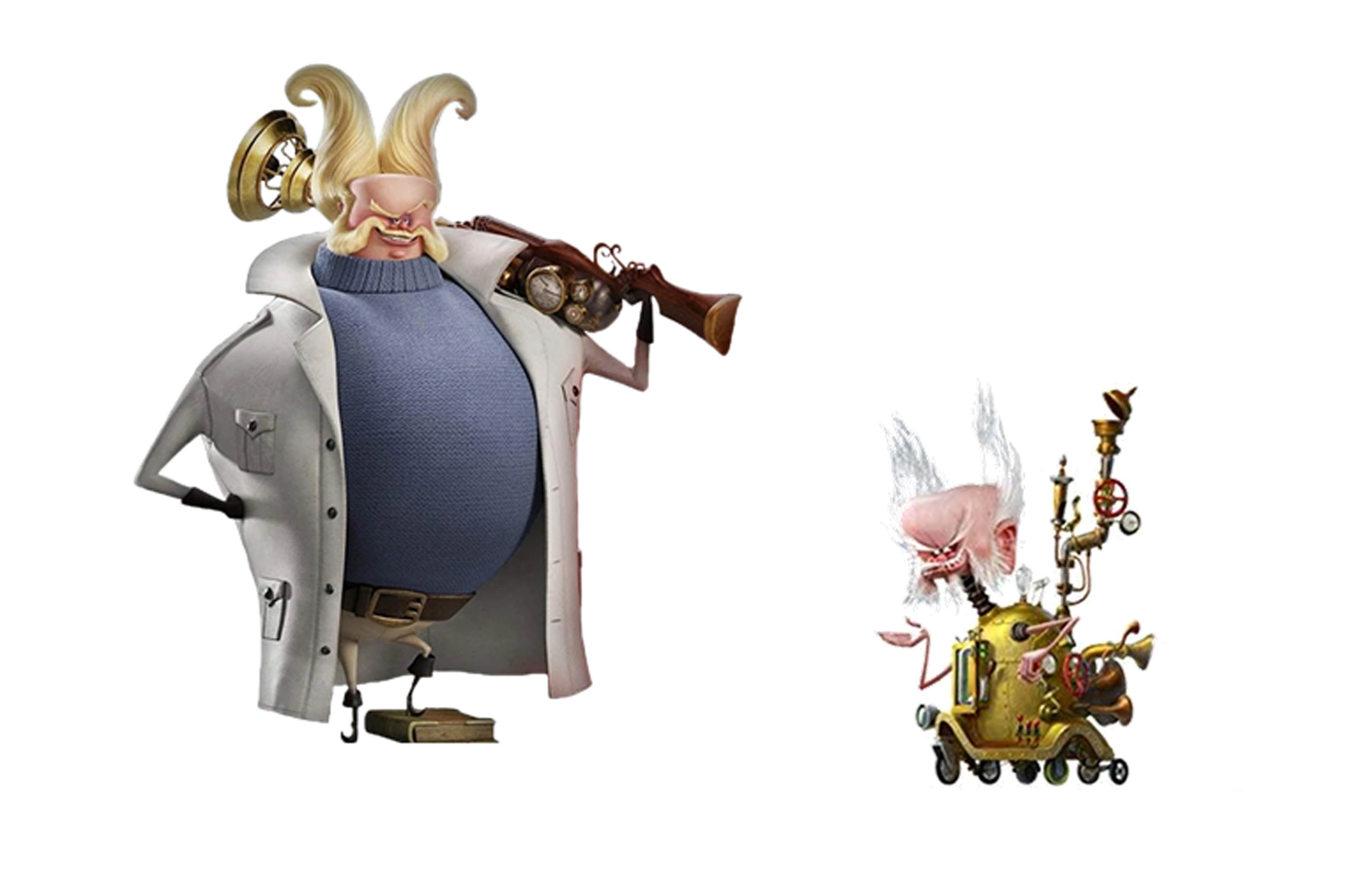
Abraham Vanhelsing- Abraham Vanhelsing, the human antagonist, replaces his ageing body with technology. His square face signifies strength and stubbornness, while the round body type suggests immaturity and stubbornness akin to a child. The spiral hair reflects his creativity in inventions, and the sharp edges on his coat, collar, and boots indicate his dangerous nature.
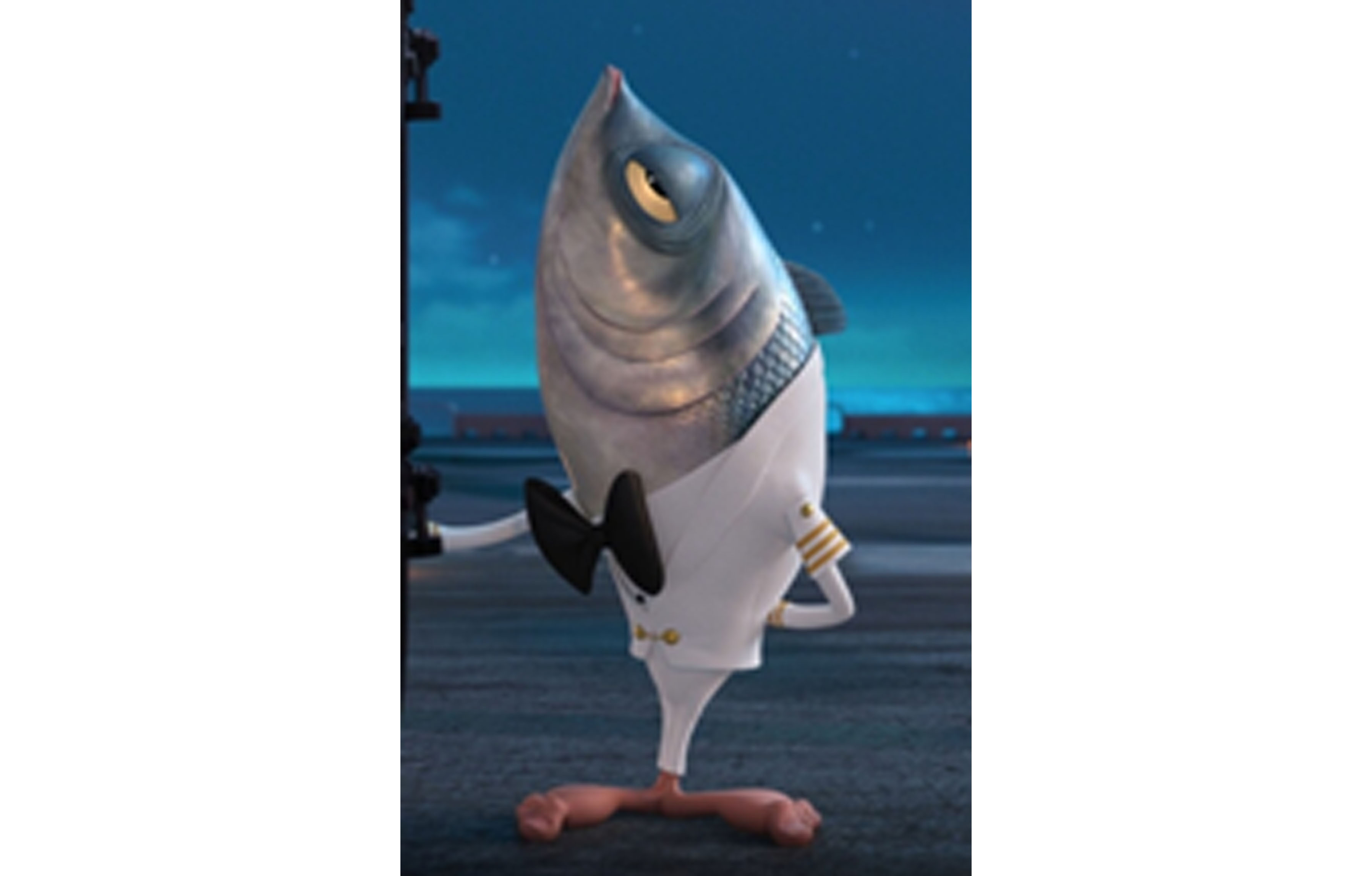
Stan- Stan is one of the 'Fishmen,' the cruise ship servants in Hotel Transylvania 3. They sport an unconventional appearance with the upper body of a fish and the lower body of a human, featuring edges and triangles on their head, fin, bow tie, and fingers. Despite appearing bored, they are highly versatile, excelling in activities like massage, babysitting, acrobatics, singing, and dancing. Stan, specifically, has a blue and silver body resembling the Bluefish with scales and human-animated feet, complemented by his white ship uniform.
Frankenstein- Frankenstein is a Huge monster and is an experimented man. Has a rectangle body, face and hands states that he is strong and reliable. Can dislocate body parts.

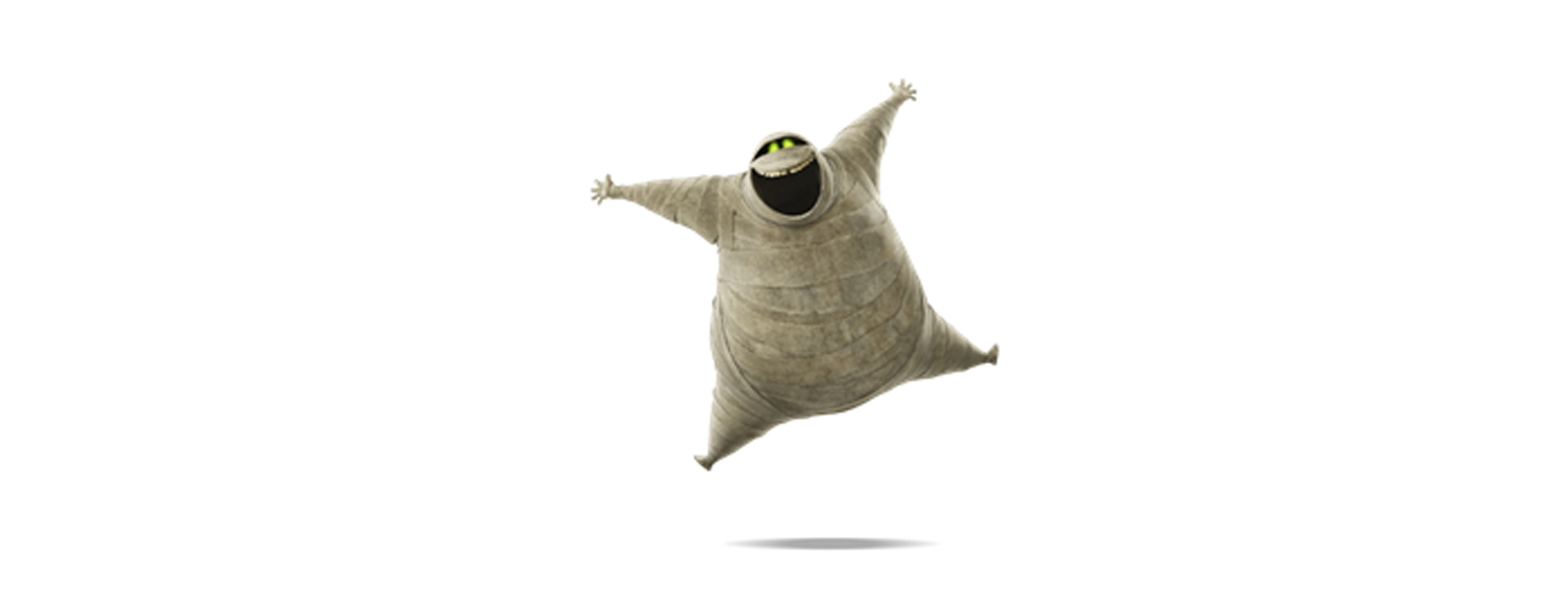
Murray- He is a sassy mummy from Egypt. Has a round body which depicts his bubbly nature. Triangular hands and legs which state he is mysterious.
Griffin- Invisible monster likes to creep around. His glasses are a mix of round and rectangular which shares his emotions. Does not have any fixed body in this sequel.

Mavis- She is the Daughter of Count Dracula. Has a curvy body and a round face. Is caring, responsible and bubbly.

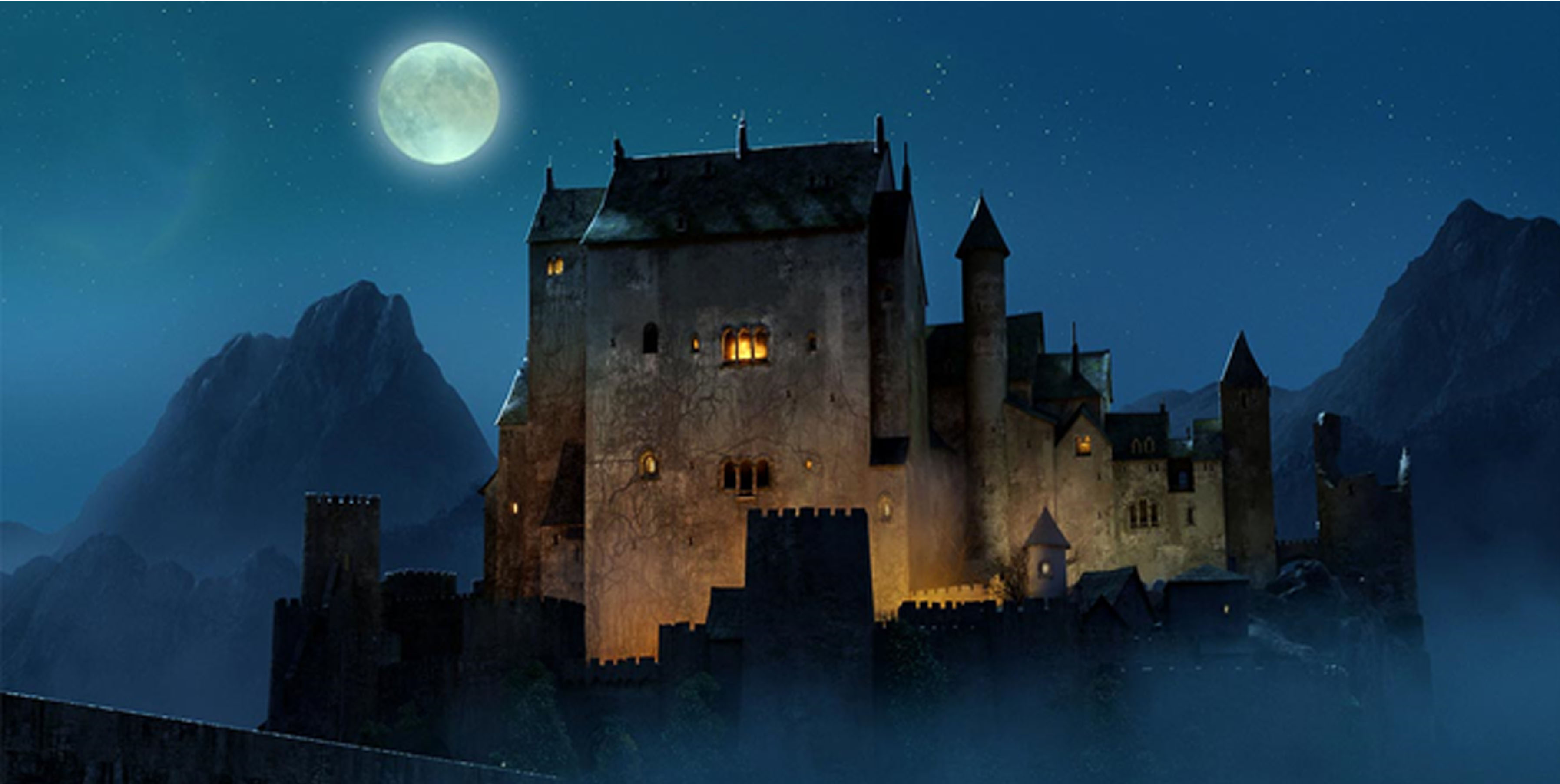
The Hotel in Hotel Transylvania 3, built by Drac to safeguard his daughter from humans, is a robust rectangular structure resembling a powerful castle. The triangular roof enhances the castle-like vibe. The colour theme used with the castle is complimentary which is shades of yellow and blue, with the white moon as a neutral colour.
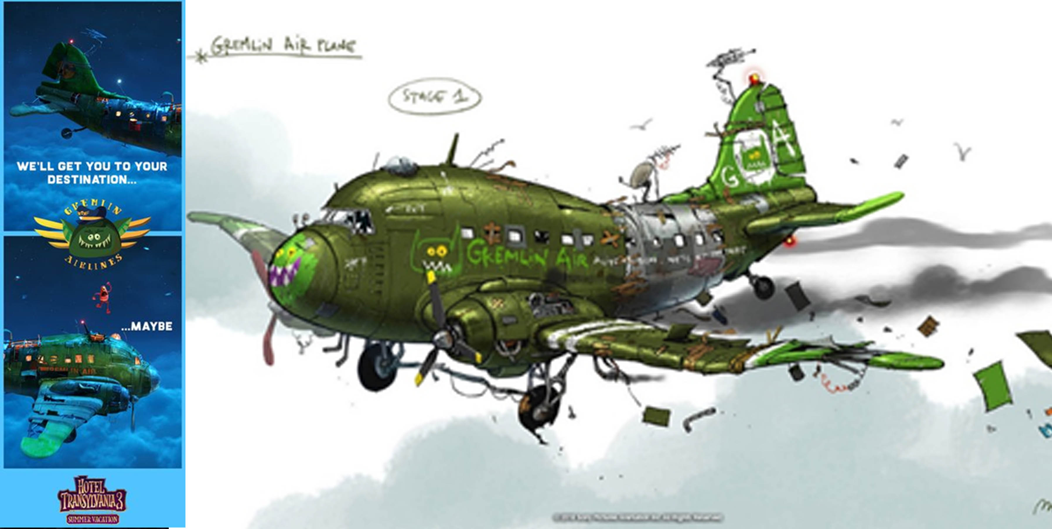
Gremlin Air, a monster-used airline, employs mischievous gremlins as its crew, known for their destructive tendencies and crash landings. Despite the chaos, the round shape of the planes, lacking edges, suggests that the monsters associated with them are kind and humble. The colour scheme used here is Analogous. Which is a green plane and blue sky. Even the text used on the green plane is orange, orange and green are complimentary to each other.
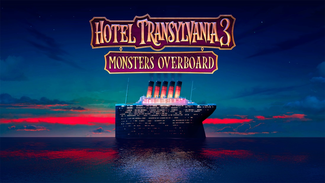
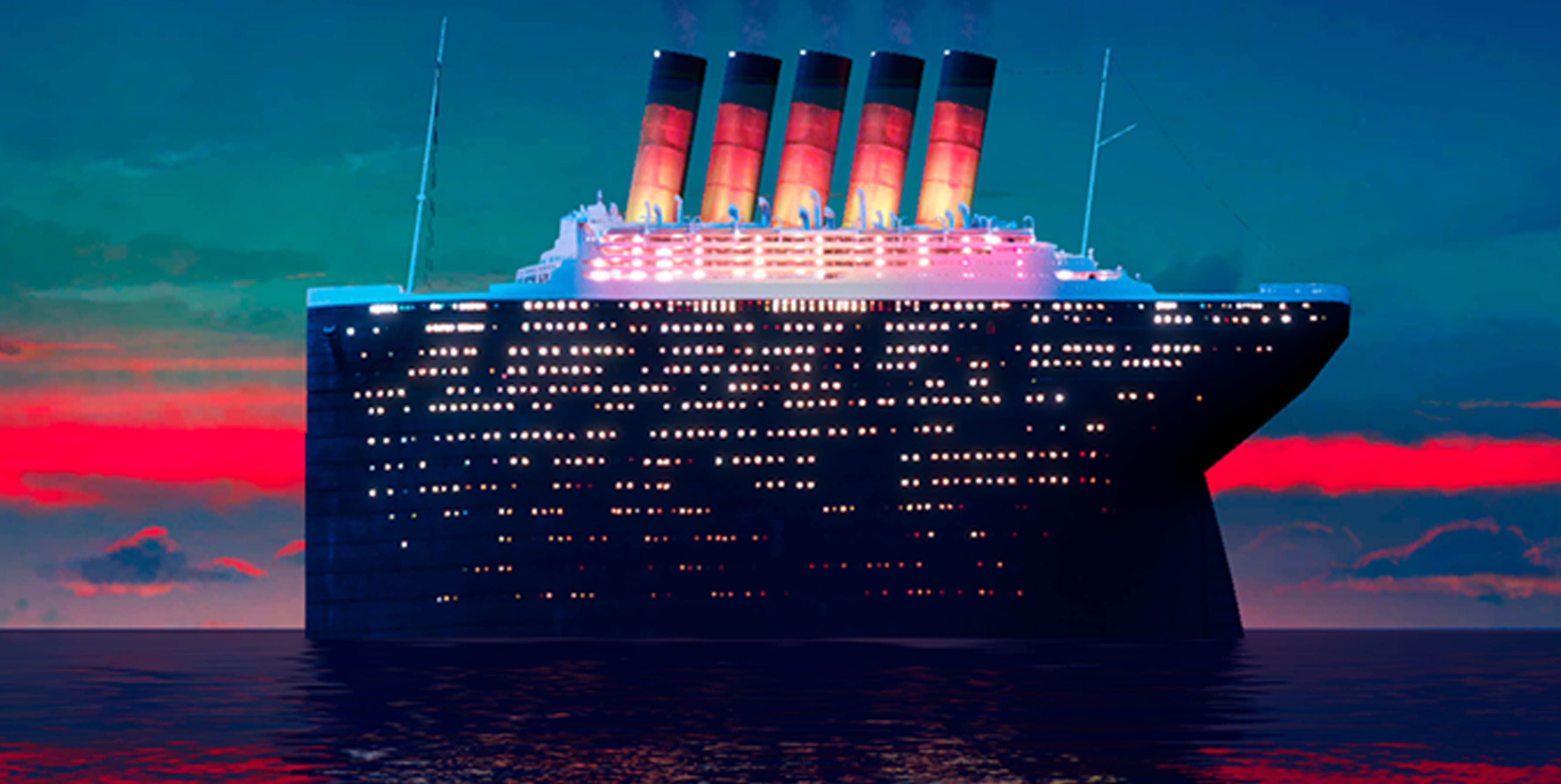
The ship Legacy is presented in Hotel Transylvania 3 as a vacation cruise which is owned by humans. The ship is somewhat rectangular and has a triangle front with some pointy edges as it is mainly owned by the villain side. The colour scheme used here is double-split complementary as the sky is blue, pink and teal, and the chimney and light of the ship are orange and yellow. The ship is coloured in black and white as they are neutral colours and are compatible.
In my research of Hotel Transylvania 3, each shape and formation describes a certain meaning or character and environment. This movie shows how even a monster can be shown as a protagonist by applying shape theory. On further investigation “Cool Colour Theme” is used in the whole movie with various colour schemes in certain plots. The humans are shown in bright colours whereas the monsters are in dark colours. further the cool and dark colour theme as the monsters are active in the night and the vacation is on a ship in the middle of the sea.